Two Point Perspective is a much more useful drawing system than the more simple One Point Perspective. Objects drawn in two point perspective have a more natural look. In two point perspective the sides of the object vanish to one of two vanishing points on the horizon. Vertical lines in the object have no perspective applied to them. The illustration below demonstrates the how to draw a box in two point perspe ctive.
| |
Monday, December 15, 2008
2 point perspective
One point perspective sketching
| Using one perspective, parallel lines converge to one point somewhere in the distance. This point is called the vanishing point (VP). This gives objects an impression of depth. When drawing using one point perspective all objects vanish to one common point somewhere on the horizon. The sides of an object diminish towards the vanishing point. All vertical and horizontal lines though are drawn with no perspective. i.e. face on. One point perspective though is of only limited use, the main problem being that the perspective is too pronounced for small products making them looking bigger than they actually are. So when would you use one point perspective? One area where one point perspective can be quite useful is for sketching room layouts.
Although it is possible to sketch products in one point perspective, the perspective is too aggressive on the eye making products look bigger than they actually are.
|
Learning to Sketch
As a designer the most important thing is to get your ideas on to paper as quickly as possible. Sketching is therefore a very important skill to master. There are a few things which will help you sketch better.
Draw using your shoulder rather than your wrist.
To sketch quickly learn to sketch from your shoulder. Most people learn to sketch on small pieces of paper, usually no bigger than A4, sketching small images. Because the images are small, people tend to learn how to sketch from the wrist. Drawing a long line tends to consist of lots of small movements from your wrist, as you move your arm along. If you look carefully at these lines they consist of lots of small arches.
Sketching from your shoulder means that you can draw lines in one continuous movement. Instead of drawing by moving your wrist, keep your wrist still and move your entire arm in one long movement from your shoulder. It's not an easy skill to master but once you have, you definitely will see the benefit.
A good way to learn is to practice drawing on large A2 sheets of paper and have the paper vertical. This means that you can't rest your wrist on the page encouraging you to use your shoulder when drawing.
There is a simple exercise that can help. Draw a series of opposing vertical and horizontal dots at each end of a piece of paper. Practice drawing a continuous line from one dot on one side of the paper to the dot on the opposite side of the paper. Gaining confidence in your drawing action is vital to improving your sketching skills.
Choosing the best type of paper
As mentioned above, sketching skills tend to improve if you use large pieces of paper. Learning to sketch on A2 paper is a very good way of gaining confidence in your skill. But most people find A2 an inconvenient size for project work. If you can, try to do sketches for your project on A3. Buy a pad of layout paper. This type of paper is useful because it is slightly opaque. When drawing final ideas you can quickly sketch your basic idea getting proportions correct and then use another sheet of layout paper placed above to trace the original sketch without mistakes and guide lines.
Sketching in pen
When sketching, pencils are the obvious choice, but I recommend using a biro for the simple reason that you can't rub out biro. This means that you will learn to put down only the marks that you really want to. Also you won't be tempted to rub out ideas. Never rub out an idea it shows the examiner that you have thought about your design and not just developed your only idea. Besides, occasionally you find that you can use some element of discounted designs..
Drawing box guides
A simple way to get the proportions of your idea correct is to sketch boxes in perspective. See the 'Drawing in 3D' section for more information about the various 3D sketching skills you can learn to master.
Wednesday, December 10, 2008
3D printing primer
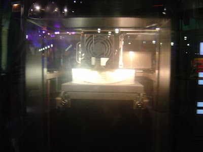
3D printing is a unique form of printing that is related to traditional rapid prototyping technology. A three dimensional object is created by layering and connecting successive cross sections of material. 3D printers are generally faster, more affordable and easier to use than other additive fabrication technologies. While prototyping dominates current uses, 3D printing offers tremendous potential for retail consumer uses
Technologies
Previous means of producing a prototype typically took man-hours, many tools, and skilled labor. For example, after a new street light luminaire was digitally designed, drawings were sent to skilled craftsmen where the design on paper was painstakingly followed and a three-dimensional prototype was produced in wood by utilizing an entire shop full of expensive wood working machinery and tools. This typically was not a speedy process and costs of the skilled labor were not cheap. Hence the need to develop a faster and cheaper process to produce prototypes. As an answer to this need, rapid prototyping was born.
One variation of 3D printing consists of an inkjet printing system. Layers of a fine powder (plaster, corn starch, or resins) are selectively bonded by "printing" an adhesive from the inkjet printhead in the shape of each cross-section as determined by a CAD file. This technology is the only one that allows for the printing of full color prototypes. It is also recognized as the fastest method.
Alternately, these machines feed liquids, such as photopolymer, through an inkjet-type printhead to form each layer of the model. These Photopolymer Phase machines use an ultraviolet (UV) flood lamp mounted in the print head to cure each layer as it is deposited.
Fused deposition modeling (FDM), a technology also used in traditional rapid prototyping, uses a nozzle to deposit molten polymer onto a support structure, layer by layer.
Another approach is selective fusing of print media in a granular bed. In this variation, the unfused media serves to support overhangs and thin walls in the part being produced, reducing the need for auxiliary temporary supports for the workpiece.
Finally, ultrasmall features may be made by the 3D microfabrication technique of 2-photon photopolymerization. In this approach, the desired 3D object is traced out in a block of gel by a focused laser. The gel is cured to a solid only in the places where the laser was focused, due to the nonlinear nature of photoexcitation, and then the remaining gel is washed away. Feature sizes of under 100 nm are easily produced, as well as complex structures such as moving and interlocked parts.[2]
Each technology has its advantages and drawbacks, and consequently some companies offer a choice between powder and polymer as the material from which the object emerges. [3]. Generally, the main considerations are speed, cost of the printed prototype, cost of the 3D printer, choice of materials, color capabilities, etc.[4]
Unlike "traditional" additive systems such as stereolithography, 3D printing is optimized for speed, low cost, and ease-of-use, making it suitable for visualizing during the conceptual stages of engineering design when dimensional accuracy and mechanical strength of prototypes are less important. No toxic chemicals like those used in stereolithography are required, and minimal post printing finish work is needed. One need only brush off surrounding powder after the printing process. Bonded powder prints can be further strengthened by wax or thermoset polymer impregnation. FDM parts can be strengthened by wicking another metal into the part.
Resolution
Resolution is given in layer thickness and X-Y resolution in dpi. Typical layer thickness is around 100 micrometres (0.1 mm), while X-Y resolution is comparable to that of laser printers. The particles (3D dots) are around 50 to 100 micrometres (0.05-0.1 mm) in diameter.
Applications
An example of real object replication by means of 3D scanning and 3D printing: the gargoyle model on the left was digitally acquired by using a 3D scanner and the produced 3D data was processed using MeshLab. The resulting digital 3D model, shown on the laptop's screen, was used by a rapid prototyping machine to create a real resin replica of the original object.
Standard applications include design visualization, prototyping/CAD, metal casting, architecture, education, geospatial, healthcare, entertainment/retail, etc.
More recently, the use of 3D printing technology for artistic expression has been suggested.[5] Artists like Bathsheba Grossman or Carlo H. Sequin use various rapid prototyping processes in many of their works.[6][7]
3D printing technology is currently being studied by biotechnology firms and academia for possible use in tissue engineering applications where organs and body parts are built using inkjet techniques. Layers of living cells are deposited onto a gel medium and slowly built up to form three dimensional structures. Several terms have been used to refer to this field of research: Organ printing, bio-printing, and computer-aided tissue engineering among others.[8]
The use of 3D scanning technologies allow the replication of real objects without the use of molding techniques, that in many cases can be more expensive, more difficult, or too invasive to be performed; particularly with precious or delicate cultural heritage artifacts.
RepRap open source 3d printer
RepRap is a project released under the GNU-license that can print plastic parts. Research is underway that will let it print circuit boards as well as details in metal. The creator said about the printer that "We want to make sure that everything is open, not just the design and the software you control it with, but the entire tool-chain, from the ground up."
What is an input device?
History
A definition of an input device was already included within the von Neumann architecture in 1945, however conception of an architecture including similar devices designed for input only appear since 1936. The von Neumann architecture describes a device designed for inserting user data, which are separated from the algorithm data and code. These devices included a keyboard or a punched card. Computer mice were invented by Doug Engelbart in the 1960s.
Classification
Many input devices can be classified according to:
- the modality of input (e.g. mechanical motion, audio, visual, etc.)
- whether the input is discrete (e.g. keypresses) or continuous (e.g. a mouse's position, though digitized into a discrete quantity, is fast enough to be considered continuous)
- the number of degrees of freedom involved (e.g. two-dimensional traditional mice, or three-dimensional navigators designed for CAD applications)
Pointing devices, which are input devices used to specify a position in space, can further be classified according to:
- Whether the input is direct or indirect. With direct input, the input space coincides with the display space, i.e. pointing is done in the space where visual feedback or the cursor appears. Touchscreens and light pens involve direct input. Examples involving indirect input include the mouse and trackball.
- Whether the positional information is absolute (e.g. on a touch screen) or relative (e.g. with a mouse that can be lifted and repositioned)
Note that direct input is almost necessarily absolute, but indirect input may be either absolute or relative. For example, digitizing Graphics tablets that do not have an embedded screen involve indirect input, and sense absolute positions and are often run in an absolute input mode, but they may also be setup to simulate a relative input mode where the stylus or puck can be lifted and repositioned.
Early devices
Keyboards
A keyboard is a human interface device which is represented as a layout of buttons. Each button, or key, can be used to either input a linguistic character to a computer, or to call upon a particular function of the computer. Traditional keyboards use spring-based buttons, though newer variations employ virtual keys, or even projected keyboards.
Examples of types of keyboards include:
Pointing devices
- Main article: Pointing device
A pointing device is any human interface device that allows a user to input spatial data to a computer. In the case of mice and touch screens, this is usually achieved by detecting movement across a physical surface. Analog devices, such as 3D mice, joysticks, or pointing sticks, function by reporting their angle of deflection. Movements of the pointing device are echoed on the screen by movements of the cursor, creating a simple, intuitive way to navigate a computer's GUI.
High-degre of freedom input devices
Some devices allow many continuous degrees of freedom as input. These can be used as pointing devices, but are generally used in ways that don't involve pointing to a location in space, such as the control of a camera angle while in 3D applications. These kinds of devices are typically used in CAVEs, where input that registers 6DOF is
Imaging and Video input devices
Video input devices are used to digitize images or video from the outside world into the computer. The information can be stored in a multitude of formats depending on the user's requirement.
Medical Imaging
Audio input devices
In the fashion of video devices, audio devices are used to either capture or create sound. In some cases, an audio output device can be used as an input device, in order to capture produced sound.
- Microphone
- MIDI keyboard or other digital musical instrument
A bit of stuff about graphics cards
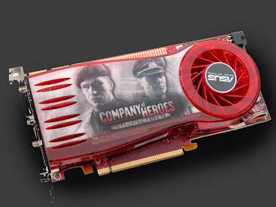
A graphics card (also video card) is a piece of hardware installed in a computer that is responsible for rendering the image on the computer’s monitor or display screen. Graphics cards come in many varieties with varying features that allow for a price range that extends from about $20 US Dollars (USD) to $2,400 USD or more.
The first consideration when buying a graphics card is to be sure it is capable of displaying the best resolution the monitor can support. For Liquid Crystal Display (LCD) monitors this means supporting the native resolution. Cathode Ray Tube (CRT) monitors do not have a native resolution. In this case, ensure the graphics card is capable of supporting the highest resolution, even if the CRT monitor will be frequently used at lower resolutions.
The second consideration is on-board memory. A graphics card must work very hard to render images to the screen. Unlike text files, graphics images are much larger files consisting of great amounts of data that must be processed by the graphics or video card. A faster graphics card has its own resident memory chips to perform this function so as not to impinge upon the system’s random access memory (RAM). Less robust graphics cards have less resident memory and require sharing system RAM to process images.
This doesn’t necessarily mean that a graphics card with shared memory will be unsatisfactory, but much depends on the primary purpose of the computer and on the amount of system RAM present. More system RAM is better if it will be shared, but for gaming and multimedia enthusiasts, a graphics card with resident memory is a better choice. This is also true for those wishing to watch, work with or edit movies.
The graphics processing unit (GPU) is a chip akin to the computer processing unit (CPU). The GPU on the graphics card processes data in parallel lines called “pipelines.” The more pipelines a graphics card has, the faster it can process data. Some cards feature dual GPUs for additional performance. Other factors that play into performance include bus speed and the type of on-board memory the graphics card supports.
Because graphics cards work hard they generate heat. For this reason most high-performance video cards utilize built-in fans. Fans can be quiet or noisy, depending on the card model. High-performance fanless video cards are also available. These cards use heat syncs to pull heat away from the GPU. The advantage of a fanless graphics card is lack of noise; disadvantages include expense and a wider footprint that can take up two slots inside the computer.
Installing a graphics card is very easy. The card features an interface that plugs into a port or slot inside the computer on the motherboard. Older motherboards offer an Advanced Graphics Port (AGP) interface, while newer boards have the faster Peripheral Computer Interface Express (PCIe) interface. A PCIe graphics card cannot be installed into an AGP slot, and visa-versa, so be sure to get a card that is compatible with your system.
External ports on the graphics card can allow an additional monitor to be plugged in for gaming or for advanced graphics displays that can be spread across two monitors. A graphics card might also have an “S-Video Out” port for sending the signal to a television, or a High Definition Multimedia Interface (HDMI) port. Advanced ports that extend functionality add to the cost of the card.
While prices vary widely, the average gaming enthusiast is likely to be happy with a graphics card in the $150 - $300 USD range. For someone who uses a computer for more general purposes, a graphics card closer to $65 USD will likely do the job. Watch for rebates and sales to get a good deal, and read customer reviews for information about issues like fan noise and performance.
What is anti-aliasing?
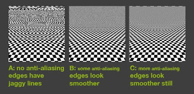
In digital signal processing, anti-aliasing is the technique of minimizing the distortion artifacts known as aliasing when representing a high-resolution signal at a lower resolution. Anti-aliasing is used in digital photography, computer graphics, digital audio, and many other applications.
In the image domain, aliasing artifacts can appear as wavy lines or bands, moiré patterns, popping, strobing, or as unwanted sparkling. In the sound domain they can appear as rough, dissonant, or spurious tones, or as noise.
Anti-aliasing means removing signal components that have a higher frequency than is able to be properly resolved by the recording (or sampling) device. This removal is done before (re)sampling at a lower resolution. When sampling is performed without removing this part of the signal, it causes undesirable artifacts such as the black-and-white noise near the top of figure 1-a below.
In signal acquisition and audio, anti-aliasing is often done using an analog anti-aliasing filter to remove the out-of-band component of the input signal prior to sampling with an analog-to-digital converter. In digital photography, optical anti-aliasing filters are made of birefringent materials, and smooth the signal in the spatial optical domain. The anti-aliasing filter essentially blurs the image slightly in order to reduce resolution to below the limit of the digital sensor (the larger the pixel pitch, the lower the achievable resolution at the sensor level).
The Creative Process

To work consistently in a creative field you need to develop a process for coming up with ideas, one of the key skills you need to do well in Computer Graphics is to be able to demonstrate an understanding of Creative process. This is primarily assessed through both the quality of your final project and the support material you provide to show how you have developed an idea.
In order to show the assessors what you are thinking you need to keep track of you ideas and how you solve problems, with a journal/folio. You should be adding a couple of pieces of work to this every week, this can consist of sketches and printouts, pages ripped from magazines, cloth samples, photos etc.
Your folio will be a major determining factor in your final mark as it helps the assessors to justify the mark they give you, it in effect aids the process of accountability.
People often have a few good ideas in their head that they have been toying with for a while which can result in an initial burst of creativity, but once they have used up these ideas, have difficulty being creative. Often bands put out a great debut album, but stumble on album number 2. This is often a direct result of lack of established creative process, a record company that sees a band faltering due to this will bring in a producer who specializes in helping bands with their creative process. The reality is that a structured approach to being creative pays off in a really big way. The process takes care of the detail work and leaves you free to think about creative solutions.
There are many theories on Creative process but they generally tend to follow this order:
Brainstorm
Finding or formulating a problem. George Kneller (American psychologist) called this stage “first insight.”
Research
Researching and drawing from life experiences (memory), networking, etc. This stage is variously called
“discovery” and “saturation.”
Think
Mulling over the problem in a sort of chaos of ideas and knowledge, letting go of certainties (forgetting). Jacob Getzel (American psychologist) called this stage “incubation” -- engaging the intuitive, non-sequential, or global thinking at the core of creativity.
Solve
One or more ideas surface. This is also called “immersion” and “illumination.”
Evaluate
The idea is tested as a potential solution to the problem. Getzel called this “verification.” This final stage often involves revision — conscious structuring and editing of created material.
Tuesday, December 9, 2008
Clay Model
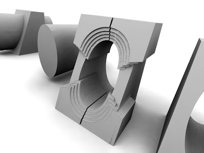
When you model in 3D it is always tempting to achieve some realism as soon as possible in the modeling process. This can be a problem however, because as you start to add textures and materials to your object, render time and screen redraw time tend to increase dramatically.
This starts to become a vicious cycle with the modeler ending up not finishing the model citing lack of patience or slow processor speed as the problem.
The industry standard method is to avoid using any textures or materials, keep your model a pure light colour that shows any faults with your model, until you are fully finished with the modeling.
The non reflective white many artists use is referred to as clay modelling because it looks like you object has been constructed from white clay.
Blender Sites
www.blender.org
www.blendernation
superboy tutorials on youtube
it is really worthwhile registering for a user name on www.blenderartists.com as this has the best range of tutorials and discussions about 3d in blender. A username lets you easliy search the forum and it's archives.
The CG society has some great discussions on 3D effects and design, and is highly reccomended.
All these sites are on the freelist but links to external images may use quota.
The best advice i can give is: all the information you need is available you just need to do your research
Sunday, December 7, 2008
Computer Graphics 08 Project Ideas
• a documented design process
• computer graphics technical skills
• aesthetic design
However there are ways you can maximise the sucess of the project
Choose an Appropriate Scale of project.
Working in 3D is time intensive try to keep the elements of your design simple but well refined, too much complexity will lead to production problems at the end.
Plan what you final presentation method will be.
Animations are great but require a large scale comittment from students, I would only reccommend this type of project for student who have previous 3D animation experience.
Posters have high impact and are fairly straight forward to produce, plan on a full2 weks of production time in Photoshop and Indesign for your poster.
Don't Emulate existing design ideas
Possibly the biggest mistake you can make with you project is to design something that looks conventional or like somthing already in existance. If you are modelling a house it needs to have exciting design elements, if it is a car make it look like nothing the assessors have seen before.
Instead, take inspiration from leading designers
True artists take inspiration from their surroundings, this includes what other artist/designers are doing. Find out what the best of the field is doing and take inspiration from this.
Develop a Production Timetable
Managing your time is one of the most important skills for the major project, unless students can demonstrate signifigant progress of their projects by mid year they will be downgraded to the level 2 course.
Tuesday, September 23, 2008
Fixing Epson R2400 Print Problems on Mac OSX 10.5
Finally a real solution has arrived! Adobe has released updated drivers for the r2400 so if you are still having probs with your R2400 and OSX then head over to Epson's site and get the latest drivers, they are dated from August 2008 onwards.
As a side note to Epson while they make great printers their Mac drivers have been awful since moving to OSX and that is a fair while ago now. I have recently bought a cheap Canon A4 printer for general printing at home and it has a much more reliable set of drivers than any Epson driver I have seen in recent years. Looks like its time to say goodbye to Epson for a while. After waiting over twelve months for a proper solution for OSX printing I would have to recommend users look very carefully at the functionality of any printer they ar considering buying, with their specific Software/OS combo before making a purchase. But at the end of the day the problem really boils down to poor development and user support on Epson's part.
The big lesson from this: If a printer is critical to your workflow then find a store that will let you try one out with your system, before you purchase or a store that has specialist industry knowledge about printing photos and graphics.
Sunday, September 7, 2008
Getting into 3D

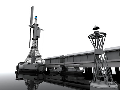
There are plenty of reasons to get into 3D modeling, you might want to see how something would look before it is built, you might want to experiment with game design or you might want to take it on for a challenge. Well I fell into all of these categories and started mucking about with a number of commercial packages but without ever really bonding with one of them.
One day out of curiosity I downloaded a version of Blender, which is an opensource 3D modelling application and well I have been hooked ever since.
If it's free, doesen't that mean its dodgey?
Well that was my first reaction but once I started working through the tutorials and checking out the help forums I realised that just the opposite was true. After putting up with Adobe's pathetic attitude towards developing products for Mac OS (I still can't hide CS3 Indesign in 10.5) I found the positive approach of Blender users to be exactly what I was after. The community has a can do attitude that is developing the software at an amazing pace.
If you are in doubt check out the amazing list of features in the current build of Blender at www.blender.org. The software is capable of anything from basic modelling and rendering through to work that is truly amazing.
What are the good points?
If you are going to invest you time in learning a new program it is important to know what you are in for, so here is my list of things that make this a worthwhile application.
1. It has a great development community and very friendly help forums
2. There is a huge amount of online resources
3. It runs on a range of operating systems
4. It can produce work of the highest quality
5. It has a really efficient interface
6. This program is building momentum!
What are the drawbacks?
1. It is lacking in presets compared with Maya and Max
2. You have to invest time to learn the software (true with all powerful 3d apps)
3. It tends to have a few idiosyncrasies in it's design
Well they are pretty minor drawbacks and Blender is curenty in the process of being rewritten for a new 2.5 version which will standardise many features of the software and make it easier for people to write plugins for. I think this will be a huge step forward for the software.
If you are a graphic artist then you really owe it to yourself to checkout Blender for yourself and decide on whether it is a tool you can get into. Check out the noob to pro wiki book and try out the "modelling a simple person" tutorial right near the start.
If you are a photographer then 3d gives you a crazy amount of control, infinitely variable focal length, adjustable depth of field, incredible lighting possibilities and the ability to move the camera to any angle in 3d space, it can be a great tool for testing out interesting shots and composition or a way of extending those skills into an entirely new area.
I wil get some tutorials happening in the coming months so stay tuned!
Wednesday, August 27, 2008
Creating a test strip
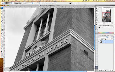
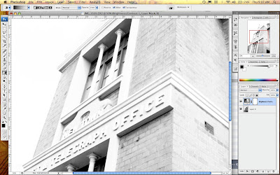
In the darkroom photographers use test strips to gain fine control over the brightness/contrast of an image. A test strip is a print that has a set of stepped graduations from light to dark that allow a photographer to choose the best tonal range for their final image.
Although inkjet printers today are quite accurate, I find it really helpful to print out a test strip so I can get maximum control over my finished image. In the darkroom printing test strips saves guess work and wasting a lot of paper, so why not use the same techniques for your digital work it will speed you up on the path to getting good prints.
To make a digital test strip here are the steps:
1 Create an adjustment layer for your image, in the above example I used a brightness/contrast layer and set this at the extreme end of brightness for dramatic effect.
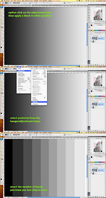
2 Option click on the adjustment layer to edit the it, and create a gradient going from black to white. Now you need to make this a stepped gradient, the easiest way to go is to select posterize from the image/adjust menu and set it at how many steps you want in your test strip, between 5 and 10 should be fine. Once you have completed this step, you should have a set of grey panels from black to white (see above).
3 Click back on your image layer and you should now have a finished test strip.
4 Print, assess tones and apply a gray in the brightness contrast over the whole image that looks best to you.
5 Print your corrected image
*In my example i have used the adjustment layer to adjust brightness contrast but you can use it for any of the funtions availabke in the adjustment layer pallette. By creatively combining different sets of gradients and effects you can create a monster teststrip that shows a huge nuber of variations. Givie it a go i am sure you will find it a very useful technique.
Sunday, August 24, 2008
Changing Focus in Your Images
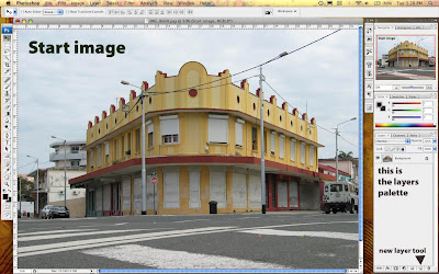
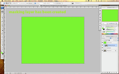
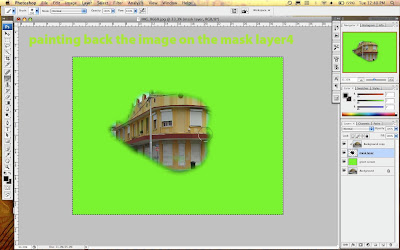
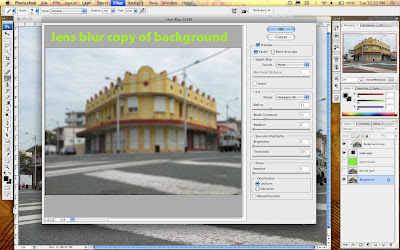
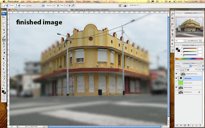
The amazing thing about Photoshop is that there are often multiple ways to achieve a single outcome. After a conversation the other week with an very experienced photographer about creating focus masks manually in the darkroom, I thought why not recreate the same technique in photoshop?
This technique is intended to give you control over de-focussing parts of you image and includes a short discussion about the different blur options available in photoshop.
1. Setting up layers.
Now open a photo into Photoshop CS (you can use this with elements too) and duplicate the layer. To duplicate drag the background layer in the layers palette onto the icon that is a page with the corner turned over.
2.Setting up the maskig layer
Create a new empty layer between these two, this is going to be a masking layer.
3. Creating a contrast layer
Create a contrast layer so you can see where you are cutting.
Make a layer on top of the layers stack and call this green screen
Select all and fill with a bright green
Now move this layer in the stack to second from the bottom.
4. Creating the mask
Option click between the top layer and the masking layer you should now have created a mask, there should be a small arrow on the top layer pointing into the mask layer.
Masking layers are difficult to describe, when there a no pixels on a masking layer, it shows none of the image layer it affects, it there is 100 percent pixels on the masking layer it shows 100 percent of the image. What this means in reality, is that as you paint a black onto the masking layer it will reveal that part of the image. You really need to try this out as it is a trick concept.
These masks are great because you don't do any damage to the image you are only changing the masking layer.
5. Paint in the masking layer to reveal your image
You should now see a solid green screen as the masking layer and it's image above are now invisible. Move to the masking layer and start painting onto the it using a black brush of a good size you should start to see your image appearing wherever you paint. To remove portions of the image you don't want, you simply select the eraser and erase the black on the mask layer.
What you need to do now is roughly isolate the section of the image you want to keep in focus,l in my example you can see the building in the forground. I have kept the edges soft so the image will smoothly transition into the blurred image we are about to create.
6. See the full image
Turn off the eye on the green screen layer to hide it.
You should now have the background layer visible.
Duplicate this layer so you are working on a copy but keep down the bottom of the stack.
7. Defocus the background image
Phew that is all the setup work... now for the good stuff
Select all on the background image copy and apply a lens blur filter, experiment with the amount till it looks good. Adjust the masking of the top layer so it looks natural.
There you have it, masking and de-focussing in one lesson, this is a big step please take careful note of the order of the layers in the images so you can see what is happening.
Saturday, August 23, 2008
File Formats For Fussy Photographers

File formats... there are endless discussions in Photography magazines about file formats pro's & cons lets just cut through all of that and get down to some effective simple advice so you can go out and take more photos.
Jpeg - it's simple don't save any of your work in this format unless you are desperate to reduce file size for emailing, web or video work. This format tends to be destructive and to the eye of a photographer produces lower quality images. Check out the above close up of a detail of a power pole, there is a strange ghosting around the pole, this is a JPEG on high quality compression and it looks bad. The main problem with JPEG's is that this ghosting really messes up subtle tonality and the three dimensional qualities of a photo. Don't get me wrong JPEG is a very powerful compressor that is amazingly useful but for photographers compression is the opposite of what you want, ie great images.
... well, thats enough of a rant, if you are going to save a file save it as either:
Tiff - this is the classic file format that has lossless compression can be read by plenty of software and has proved to be very reliable over the years. Save in this and you cant go wrong.
Photoshop - save those stacked & layered documents in Adobe's PSD format for good quality and the ability to edit down the track.
If you are using an image storage application like IPhoto that really likes JPEG's use it only as a secondary program for viewing photos but keep a file of your original uncompressed files as well.
There are other file options that have their good points in specific areas but the above two are versatile and have stood the test of time. Leave all that talk of metadata and bizarre profiling to all those nerdy photography magazines or for people that need to manage a big library of images that is searchable.
Friday, August 22, 2008
Ahoy There! it's Levels Island
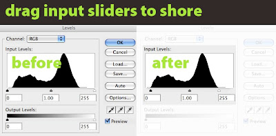
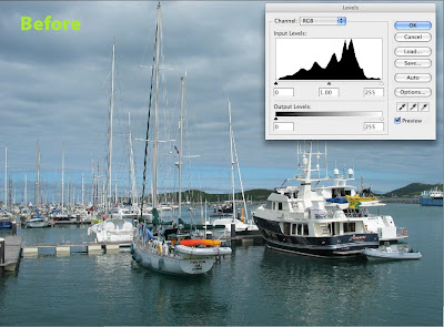
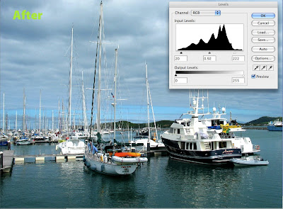
In the last article we had a look at what the levels controls do, but in this article we are going to have a look at one of the most common ways of improving photos especially colour images that your camera has given the JPEG treatment.
Welcome to Levels Island! Control L to find the treasure...Often, when you open an image that has been shot on auto or a variation of, you end up with a histogram in the levels settings that shows what looks like a mountainous island rising from the middle of the image. There is often plenty of flat water surrounding this mysterious island. In this case an easy point to start from is to move the black and white sliders onto the start of the island... or as I tell my students move those scurvy rowboats into the shore of levels island! Sometimes you have to drag those boats onto the beach and right up into the sand dunes, find the setting that looks good. Watch your tones carefully, be especially cautious about blowing out the tonal range of the whites, once you have sent them to Davey Jones locker they ain't coming back.
I know it's a silly analogy but editing photos in Photoshop should be a fun, creative process... so you Land Lubbers once you have those boats into the shore start experimenting with slowly adjusting the position of the midtone slider. This one is delicate so be gentle and remember it's start position is 1.00 in the panel below the slider.
When you set your levels properly it should almost be like a fine haze has been removed from your image, its a simple but effective technique. Check out the difference in the above photos it has compressed the dynamic range slightly but has yielded stronger colour and clearer tones.
Don't forget command+L for levels. Make this one of your first stops in Photoshop and you too will find the buried treasure hidden in your photos on levels island!
Thursday, August 21, 2008
Adjusting Levels - White Treble Black Bass
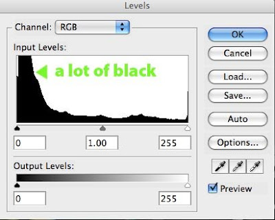
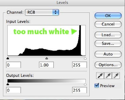
In my work flow I always do some adjustment of the levels of an image. levels gives you a look at the histogram for an image which is always good to check out. There was a dance track in the 90's called White Treble Black Bass, I am not sure if they are fans of adjusting levels in Photoshop but it is part of a handy analogy.
• The levels command is like the graphic equaliser for your stereo but for an image.
• The Blacks are on the left, the whites on the right
• The left slider controls at which point the colour rolls of to Black
• The right slider controls at which point the image rolls off to white
• The middle slider determines where the 50% midtone is
Below the histogram is a second set of sliders called output levels, these are limiters. Where the left one is set determines the darkest tone that will appear in the image. Where the right slider is, determines the lightest tone that will appear. Experiment with the controls to try it out, this slider isb more for limiting tonal range in final print or for production offset printing where solid blacks or total whites can be problematic.
Set the black and white sliders first then set the midpoint, remember you are looking to increase tonal range and increase the clarity of the image. Setting levels can make a huge difference to an image and is often the major difference between a straight out of the camera shot looking pretty good and really good.
Putting the grain back in


When you look closely at a digital photograph you notice that the tonal structure is really smooth, at magnification the image becomes hard to focus your eyes on. I find that this is a negative quality of digital for me, the grain in film based work seems to help your eyes to perceive the three dimensional space that an image is trying to recreate.
It sounds crazy but adding noise to the image actually helps to define shapes and give the image a more robust look.
There are software plugins available that can do this for you or you can also find hi-res scans of film grain available on the net. These scans are of a continuous mid tone gray from a piece of film and give you a fairly authentic looking grain structure on your digital image. To apply paste the grain on as a new layer and then set the layer to overlay mode. Now experiment with the opacity slider to get the result you are after.
To see the results of this you need to print to a really high quality printer and/or fairly large but as always the results are dependant on your imagery and you own personal style.
This is all a bit of a DIY approach and that is the fun of it however if you want to get quick high quality results then Alien Skin Exposure Plugin really delivers on simulating film without the fuss, but it is a piece of software you need to use a fair bit to justify the cost.
Using Adobe RAW in CS3 Photoshop
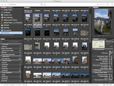
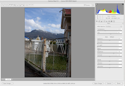
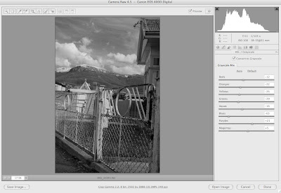
When you have your shots downloaded to your computer, use Adobe Bridge to browse to your Raw images and double click to open in Photoshop.
The file will now open up in the Raw plugin which is standard in CS3. On the left panel adjust the exposure control to put the pic where it starts to look good. Use a combo of the controls to get the image looking natural. All the controls are well labeled and do what you would expect.
The histogram on the top of the controls provides a great way of checking out the detail and range of colour in the shot. If you are not used to looking at a histogram then work off the image. The histogram shows the spread of tonality across the image, you would normally expect it to look something like a mountanious island coming out of the sea, large dips or holes in the island can indicate a potential problem with the image. I will go into more detail on reading histograms in a later post.
If you want to convert to Black and White then there is a great set of tools that allow you to alter the way colours convert to greyscale. Remember all of this work is non destructive. Take you time and approach it just like you would working in a darkroom. This is a critical time in getting your image right.
Trust your eyes... if it looks good then you are on the right track.
If you want a dramatic sky then try pulling down the blue slider until you are happy with the result.
Once you click ok (or option click ok to make a copy) you will head into Photoshop ready to push things further.
Wednesday, August 20, 2008
Exposure Tests Using RAW
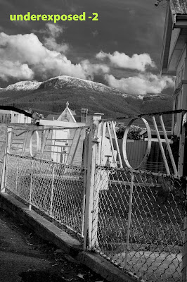
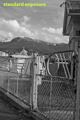
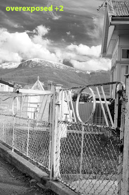
Do you over expose, under expose, or trust your light meter when shooting digital?
In the good old days when I was shooting B&W film I pretty much always overexposed a stop or two. After doing my research on the web it really was time to get out in the winter air and start testing for myself. There is a complexity in assessing exposure in that you have to manually adjust each raw image to get the best look out of it. I don't go for super Ansell Adams style tonal range, I just like to aim for a photo that matches my own personal aesthetic.
In the above shots I bracketed +2 to -2 and ran them through Raw in Photoshop, and assessed the results for myself to my own aesthetic. I recommend this is how you approach this process. Go out do some test shots yourself, then process to get what you consider to be the best and compare.
Digital Cameras are great at handling tonal range in the highlights but struggle in the low light areas, so overexposing seems to provide an excellent balance of detail in the shadows and detail in the highlights. If you like a bit of contrast and some moody sky try overexposing 2 stops... it works for me.
Next I will have a look in more detail at processing photos in RAW.
Keeping it RAW
If you are shooting with a digital camera set on a compressed format then the camera does quite a few things. It takes the output of the CCD runs it through the image processor in the camera, tweaks up the look of the image and then converts the data to JPG and stores on to your flash card. The camera has to do this all really quickly so you can take the next shot. For this reason the processors in cameras are optimised for speed not necessarily the ultimate in quality.
If you shoot in RAW then the camera takes the output off the CCD and dumps it straight onto the flash card for you to muck about with later on. What this means is you can now take you time optimising the file at your leisure without the time pressure of having to take another shot. You now have the ability to use the full power of your computer for what it is good at... doing complex computations in this case optimising your photos. So wake that computer up and get it cranking out some images!
If you are using Photoshop CS3 browse to your RAW files and open them up, they will open into the Raw plugin in Photoshop. This is where the good stuff begins and will be the subject of my next post.
Just a s a gentle reminder, there is a lot of conjecture on all things photography related, if you are not sure about something go and do the research there are some brilliant resources available on the net.
It is my belief that if you know what a great photo looks like why risk shooting in any other format than Raw? It is a bit of extra work, but at least you don't have to kick your family out of the bathroom so you can process some film!
Bringing back those golden days of the darkroom in digital form.
After plenty of reading I realised that I had spent a huge amount of time developing my own photographic style and that the film type, developer etc was a major part of it. Moving over to digital the quality was great but I had lost all the elements that shaped the final quality of my photos.
I have done plenty of reading on the subject and read opinions from many different angles, here is my take on a Digital Photography workflow that works for me, is simple and most importantly brings back a bit of excitement to my work.
The following posts are my opinion on the subject, if you are not a fan of what I have to say then you might be better heading over to a more technically minded site and forming your own opinion, lets not forget that image quality is highly subjective.
Hi... please check this menu for articles
Stay tuned I wil be adding material covering: Digital Photography, Blender 3D and Adobe CS