Blender 2.5 is really starting to come together, Ton has been cracking the whip and the programmers have been working full tilt. I am sure that it takes a single visionary such as Ton to steer an open source project in the right direction.
Mr fox dog has produced an excellent tour of 2.5, so I have mad a few basic notes from it.
you can chect it out at: http://blenderlabrat.blogspot.com/20...25-tour-8.html
Also heck out: http://wiki.blender.org/index.php/User:Mikahl for some NLA editor documentation
The shortcuts will continue to evolve as the software grows but here is a current list of them:
• Tools Panel - T
• In 2.5 the buttons window only contains settings not tools
• There are new tool tips that also show the python operator under them
• Console has its own window, you can select actions and hit replay to repeat
• User Prefs are now available under file>user prefs
• The new file browser is full screen with favourites and file filters
• Keymaps > change outliner to keymaps to view & edit.
• Particles the video shows a cool combo of particles and explode modifier
• NLA editor click on snowflake to create an action
• Bump maps now work really well!
• The new render integration looks great!
Here is a good list of 2.5 key commands from:
http://blender-dev.blogspot.com/
Key board short-cuts for blender 2.5 dev
universal:
* "F1" open blender file
* "F2" save as
* "F3" repeat history menu
* "F4" scroll assistance / switch panel sides
* "F5" switch panel sides
* "F6" previous operation properties (nicer than "t")
* "F7" run script
* "F11" full screen
* "F12" render
* "ctrl+q" Quit
* "ctrl+w" quick save
* "ctrl+alt+w" duplicate window
* "ctrl+u" save user settings
* "ctrl+o" open resent
* "ctrl+alt+s" split region menu
* "ctrl+alt+shift+s" split region into 4 parts
* "ctrl+alt+f" search
* "ctlr+shift" redo
* "ctrl+z" undo
* "alt+a" play back animation (in all windows)
* "ctrl+x" reload startup file
(3D view port):
* "v" switch to vertex paint
* "tab" toggle into and out of exit mode
* "r" rotate, (add x,y,z to rotate only about these axis )
* "alt+r" clear object rotation
* "t" toggle last operation properties panel
* "I" Insert Key-frame
* "alt+I" Delete Key-frame
* "ctrl+I" Invert selection (selects all unselected items)
* "a" toggle deselect, select all
* "shift+a" add object menu
* "s" scale
* "shift+s" snap menu
* "b" box select tool
* "shift+b" zoom to box selection
* "n" properties panel
* "ctrl+space" maximize sub window
* number keys, vie that layer,
* shift+number-key add layer to view
* alt+num-key is for second Row of layers
* "ctrl+alt+t " ten timer menu, animation playback control
Object mode:
* "ctrl+t" track menu
* "alt+o" clear object origin
* "ctrl+p" parent menu
* "alt+p" clear parent
* "alt+s" clear object scale
* "ctrl+g" group
* "ctrl+shift+g" add to group
* "ctrl+alt+g" ungroup
* "alt+g" clear location
* "shift+l" select linked menu
shared between object and edit mode
* "ctrl+alt+c" set centre menu
* "c" add to selection tool
* "x" delete selection
* "alt+z" toggle texture view
* "z" toggle wire frame view
* "alt+h" undo all hide
* "h" hide menu
* "g" grab move
* "shift+d" duplicate selection
* "shift+a" add object menu
* "shift+w" Warp
Edit mode
* "ctrl+tab" select mode (eg switch between vertex edge and face modes)
* "w" subdivide menu
* "shift+w" warp
* "e" extrude
* "alt+r" spin (use "t" or "F6" to change properties)
* "shift+t" triangulate
* "u" unwrap menu
* "shift+p" mesh separate
* "alt+s" shrink/flatten
* "ctrl+shift+s" to sphere
* "shift+f" fill mesh (faces)
* "ctrl+f" faces menu
* "alt+f" beauty fill faces
* "shift+g" similar vertex select
* "alt+j" triangulated mesh to quad
* "l" select linked
* "shift+l" deselect linked
* "ctrl+n" make normals ...
* "ctrl+alt+shift+m" select non manifold
Button Window
* Right click on any value impute to control variable with a key frame, or driver.
* "I" to insert a key frame will hovering mouse over any value input
* "d" to add driver
* "ctrl+centre-mouse-button" will reseize the content, try it!
Background Image
Load your image in the uv image editor,
in the 3D view properties window (N key) you can enable the Background Image
dont forget to toggle orthographic view (numlock 5 or keypad 5)
Sunday, August 2, 2009
Tuesday, July 21, 2009
Makehuman 1.0 close to release.
Makehuman 1.0 is close to release, it is a human creator that can easily create models to be imported into a range of modelers/renderers. It features some nice new features that make it easy to create humans from a specific region of the world and the body shapes seem to be much more editable. Blender users will find a well established workflow documented on the site.
The makehuman generated models contain armatures that make for easy rigging and posing.
Check out www.makehuman.org for the release.
The makehuman generated models contain armatures that make for easy rigging and posing.
Check out www.makehuman.org for the release.
Sunday, June 28, 2009
Blender F1 Challenge Winners announced
Tuesday, June 23, 2009
LuxRender for Blender
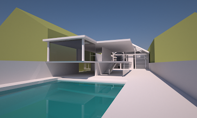
I have been following the development of a number of renders over the past few years waiting for one to really stand out as being
• kickass quality
• well thought out interface
• easy to use
• opensource
• works well with Blender
• works on OSX
and it looks like Luxrender really has come up with the goods, it has taken over from Yafray for me as my easy to set up good quality renderer. The Blender internal is good but i don't always have the patience needed for mucking about to get it spot on, i would prefer a renderer do this for me. You need to experiment with the settings until you get the kind of setup you are happy with, but from then on its smooth sailing.
The blender exporter is starting to integrate really nicely with blender, there is even a use blender materials button which could be really handy. Don't forget if you are using uv textures make sure you map them to the uv co-ordinates instead of just leaving them in the unwrapper image browser in Blender.
Render time is obviously dependent on the scene but leaving things to run overnight should yield some good results, this is an unbiassed render engine so the longer you leave it the more refined the image becomes.
Check out luxrender at: http://www.luxrender.net/
Also Alan Brito has some excellent resources at: http://www.blender3darchitect.com/
Monday, June 15, 2009
Game Creation in Blender
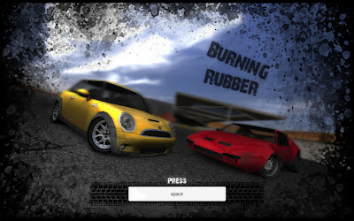
In case you haven't got the idea by now i am a big advocate of Blender 3D as a content creation and training tool due to it's great feature set and excellent development community.
A group of students from school have been working very hard on developing a game for the Blender game contest... and thaey have done a fantastic job!!!! here are some of the details, so check it out and the rest of the entries, it is amazing what can be achieved with good tools and a great attitude to learning.
http://blenderartists.org/forum/showthread.php?t=157542
game site: http://burningrubber.awardspace.com/
Title: Burning Rubber
Team: SpewBoy (Ben Evans, 15) and PiroManiac (Callum Howard, 16)
Categories: Graphics and Gameplay
Description: This is a full on racing / stunt game featuring two cars, a criminal organisation and a US Military Airbase.
Features:
-> A vast open airbase level situated in a desert environment
-> Two completely different cars, both highly detailed
-> Realistic vehicle damage
-> Fully destructible structures
-> A mysterious storyline and a nice surprise at the end
-> The latest graphic effects such as Bloom, Depth of Field, Motion Blur, Realtime reflections and SSAO
-> Great gameplay as well as great graphics
-> Stylish menu system and music to suit
-> Can easily be optimized for better performance or quality
Requirements:
-> GLSL support is recommended but not essential to play the game.
-> 1GB Ram. Less is untested.
-> Blender 2.49.
-> Should work with Mac and Linux operating systems as well as Windows. Intel Macs will have no sound, as Blender doesn't support this yet. Linux is untested.
Tested only on Windows and Mac. I can almost guarantee that this will work on any Intel Mac. Works on a Macbook with integrated graphics card. Works on a Windows PC with nVidia 9600GT graphics card, 2gb RAM and 2.0GHz dual core processor. Any resolution will work for the blend but the runtime must use 1280x800 or higher to work correctly.
If your playing on a computer with very little graphics support, clamp the textures to 512 in the blend for more performance. This is done by going into the preferences section and thene going to the openGL section, there you will find an option to clamp the textures. Lower means more performance. If you have a very old system you may clamp to 256 or 128, but this will severely reduce graphical quality.
NOTES:
How to reset car: What isn't mentioned in the game, as it is a recent feature, is that if you hold down the "R" key for one second you will be able to restart the level, in case you get stuck.
Other controls and problems: Scroll in and out to zoom in on the car when playing or in garage. Press "c" to change camera but make sure Depth of field is off when using an interior or hood camera or your vision will be quite blurry .
The menu system: For anyone who might be confused:
- RIDE menu item takes you to a car selection screen
- TWEAK takes you to a garage where you can view your car and is a good place to activate the visual effects
- BURNIT takes you to a level selection screen, from which you can start playing the game
- COOL OFF is the quit game item. Select this to quit the game
If you get into trouble and something isn't working right or you just want to quit fast, press F1.
Download (Both downloads are FIXED. A fatal bug meant the game could not be finished but that is fixed):
Blend - For Windows, Mac or Linux. Use this if you have a Mac, use Linux or would like more flexibility, such as texture clamping.
Runtime - For Windows. Should provide performance improvements, but less flexible, so no texture clamping for older graphics cards, and has a fixed resolution.
Screenshots:
Tuesday, March 24, 2009
Cleanup your Sketchup models Meshlab

Lately I have been getting further into using Google Sketchup, it has a great deal of hidden power under the surface, but one thing it is lacking (if you are using the free version), is a decent render option.
This is the workflow I have been using:
1 Export my finished model out of Sketchup as a Google Earth file.
2 Rename the model extension to .zip
4 Unzip the file
You can now browse inside the components of the file to find the .dae file which
is a collada file, a pretty standard 3D file that most programs can import.
5 Open Meshlab, tidy up the file and export the file.
6 Open into blender & render away
Meshlab is available from http://meshlab.sourceforge.net/
and is proving to moderately stable.
Tuesday, March 10, 2009
Design process example


This is a great example of the design process in action. The design is not yet at the production stage but you can see some very clear thinking and idea development.
Note there was a very specific objective that the designers had in mind which has allowed them to concentrate fully on achieving a really different design.
check out thier stuff at: http://www.slackervision.com/cpyott/daws/index.html
The Design Process

We have looked previously at the Creative process and how it is important to use a methodology to help you keep generating new ideas. Now it's time to look at the design process, this is the process of developing ideas and design to meet a set need (ie a brief).
Step 1 Define the project.
The project needs to have set parameters in order for the designer to have focus and to make sure all interested parties want a similar outcome. If the design is to be a chair the project brief should contain information on:
• Design Style
• Function
• Materials and Manufacturing
• Price
•Target market/end user
Step 2 Research Ideas
The designer then should research other ideas related to the brief. It is not good to work in total isolation, seeing other designs will give you more ideas and help you to avoid mistakes ogthers have made.
Step 3 Generate Ideas
Sketching is a very important part of the design process, Computer Graphics software tends to push users into producing certain styles and forms in their designs purely because some things are easier done than others in certain programs. Confident sketchers have the ability to translate their thoughts straight into a working sketch.
Thsi is a great skill to have but requires practice to achieve and maintain.
Step 4 Refine Ideas
The designer should then take the time to look critically at his/her ideas and make sure they are relevant to the brief.
Step 5 Present ideas to client/user
The designer then presents the ideas to the client who may wish to make changes or may ask the designer to further refine the ideas. Communication between all interested parties at this point is vitally important so that everybody knows where the project is headed. Extra time spent at this stage saves much time and anguish later on. Good designers tend to be also good communicators for this very reason.
Step 6 Further Refinement
The design is then further refined, at this point a client may choose to show early visualisations of the design to a sample of the Target Market to guage their response to the product.
Step 7 Final Design
The designer moves ahead with the final design once agreed upon by the client. The final design needs to be fully specified so as it can successfully produced. At this stage the designer may work with production houses such as plastics moulders and printers, or may set out the design process steps for their own use if they are a designer maker.
Step 8 Final outcome/Production
All parties agree that design brief has been met and the design goes into use or production.
Monday, March 2, 2009
Sunday, March 1, 2009
Photoshop Sites on the Free List
here are some good photoshop sites,
all of them are on the free list.
www.gfxartist.com
www.pswish.com
http://psd.tutsplus.com/
http://photoshoptutorials.ws/
www.deviantart.com
www.tutorialized.com
all of them are on the free list.
www.gfxartist.com
www.pswish.com
http://psd.tutsplus.com/
http://photoshoptutorials.ws/
www.deviantart.com
www.tutorialized.com
Friday, February 27, 2009
Blender 2.5 is on the horizon
The blender community is starting to get excited about the release of version 2.5, which is a ground up rewrite of the software. Until now the code runs well but is starting to creak under constant revision over the years.
Starting march 3 there will be winter camp in which b lender developers will get down to some serious code development which should make a big dent in the re-write project. This is going to be a very interesting project to watch as blender has a dedicated community who are really starting to set the pace as far as open source software development goes.
Users of macbooks who are suffering from slowdowns and unreliability due to graphics integration on their machines should be keenly following progress of the rewrite.
The new API should make for easier development of plugins for developers which could be a massive boost for the software. In the past easy plugin devlopment has paved the way for for the fast development of features into a major software suite, Adobe's handling of plugins over the years is a good case in point.
Saturday, February 21, 2009
Frame up you renders for Dramatic Results

Book design and illustration has a lot to teach us about framing renders for maximum effect. Using super wide lenses allows you to distort foreground and background scales to create interesting results. Next time you do a render don't settle for 35mm try going for 10mm or even up to 100mm to compress objects.
Thursday, February 19, 2009
Bauhaus - the origin of modern design

Post World War One in Germany was a culturally experimental time and out of this era came one of the most influential and important design movements of the 20th Century.
There is plenty of good info available on the web about the nitty gritty details about Bauhaus, but to put things really simply bauhaus was:
A Design and Aesthetic movement that embraced modern manufacture process to create high quality design pieces that were available to a wide group of people. Bauhaus had a very specific simple geometric aesthetic that did away with excess decoration, and got down to incorporating form and function into their pieces.
The Bauhaus set were design hardliners that changed aesthetics of the time from decorative artisan produced pieces to functional aesthetically pleasing pieces of design. Their sphere of influence included ceramics, graphic design, architecture, interior design, furniture design and fashion.
The most important European school of design and architecture in the 20th century was founded in Weimar by Walter Gropius in 1919. He gave his vision of the regeneration of humankind the programmatic title of the " Bauhaus”. Like the medieval cathedral stonemasons’ lodges, the school was intended to unite all the artisanal crafts under one roof: cabinetmaking, sculpture, workshops for metalworking, ceramics, mural painting, weaving, commercial artwork, photography and the Bauhaus theatre. A compulsory preparatory course helped students to throw overboard what they had previously learned in order to free their senses for a new visual and haptic exploration of the world.
Weimar - Dessau - Berlin
Gropius’ vision underpinned the Bauhaus during its short life through various periods of development and locations: the emphasis on craft production at Weimar, designing for modern industrial society at Dessau from 1925 as well as the more academic orientation of the curriculum under Mies van der Rohe in Berlin from 1932.
The National Socialists closed down the Bauhaus in the spring of 1933, but were unable to prevent its teachings, pedagogic innovation and its free, experimental spirit from being disseminated all over the world. The lifestyle aesthetic developed at the Bauhaus had a profound influence on the modern living environment. Many of its ideas, prototypes and everyday utilitarian objects have enjoyed unprecedented success over the past 80 years. Furniture designed at the school has become an icon of classic modern interior design.
Standard types
The „New Style of Living“, often designed with those living at the minimum existence level in mind, today still represents the standard for statefunded housing. The furniture for these „people’s apartments“ was standardized on Bauhaus production principles. According to Gropius, „….a good thing can only have one definitive solution, a standard type“. At first, the standard type was a unique individual piece. With the gradual reorientation of the Bauhaus towards technical production processes at the cutting edge of industrial development („Art and technology – a new unity“) it lost its individuality and from the middle of the 1920s came to be regarded as an element in a programme of furniture that could be combined at will.
Designers and Architects
The creators of this furniture were students from the cabinet-making and interior design workshop which students of architecture such as Marcel Breuer, Hin Bredendieck, Erich Brendel, Erich Dieckmann or Ferdinand Kramer also had to attend. Many important innovations – unit furniture, minimal interior design, tubular steel furniture – were developed by the directors of the Bauhaus, Walter Gropius, Hannes Meyer and Ludwig Mies van der Rohe, themselves. The new spirit of architecture evoked an open, uncluttered sense of space. The Bauhaus was the first school of design to take into account this visual and spatial reorientation.
With their functional designs for furniture that was easy to construct and dismantle and made from materials such as tubular steel, laminated bentwood and fabric woven from a specially developed extra-strong yarn known as "Eisengarn”, the designers and architects of the Bauhaus invented a universal language of design whose enduring success was based on its clarity and modernity of form.
Agood starting point to find out more is: http://en.wikipedia.org/wiki/Bauhaus
Pantone Selects Color of the Year for 2009: PANTONE 14-0848 Mimosa
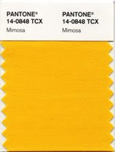
Mimosa Embodies Hopefulness and Reassurance in a Climate of Change
CARLSTADT, N.J., Dec. 3, 2008 - Pantone, an X-Rite company (NASDAQ: XRIT), and the global authority on color and provider of professional color standards for the design industries, today announced PANTONE® 14-0848 Mimosa, a warm, engaging yellow, as the color of the year for 2009. In a time of economic uncertainty and political change, optimism is paramount and no other color expresses hope and reassurance more than yellow.
"The color yellow exemplifies the warmth and nurturing quality of the sun, properties we as humans are naturally drawn to for reassurance," explains Leatrice Eiseman, executive director of the Pantone Color Institute®. "Mimosa also speaks to enlightenment, as it is a hue that sparks imagination and innovation."
Best illustrated by the abundant flowers of the Mimosa tree and the sparkle of the brilliantly hued cocktail, the 2009 color of the year represents the hopeful and radiant characteristics associated with the color yellow. Mimosa is a versatile shade that coordinates with any other color, has appeal for men and women, and translates to both fashion and interiors. Look for women's accessories, home furnishings, active sportswear and men's ties and shirts in this vibrant hue.
Mimosa is also one of the 3,000 colors available in Pantone’s line of superior-quality, eco-friendly paint. PANTONE Paints combine the accuracy of PANTONE Colors with the beauty of high-performance Dutch paints. Perfect for the kitchen or family room, painting a wall in Mimosa will add warmth and cheerfulness to any room, especially during the winter months. Mimosa also creates the illusion of being connected to the outside, making small rooms feel open and inviting.
Wednesday, February 18, 2009
Blender Links
All these sites are on the free list:
Blender specific
www.blenderartists.org
www.blendernation.com
www.blender.org
http://en.wikibooks.org/wiki/Blender_3D:_Noob_to_Pro/Modeling_a_Simple_Person
Renderers
www.luxrender.net
www.kerkythea.net
Materials
http://matrep.parastudios.de/
www.grungetextures.com
General CG Sites
www.cgsociety.org
http://photoshoptutorials.ws/
www.tutorialized.com
www.gfxartist.com
Design
http://www.yankodesign.com/
Monday, February 2, 2009
Subscribe to:
Comments (Atom)


