Wednesday, August 27, 2008
Creating a test strip
In the darkroom photographers use test strips to gain fine control over the brightness/contrast of an image. A test strip is a print that has a set of stepped graduations from light to dark that allow a photographer to choose the best tonal range for their final image.
Although inkjet printers today are quite accurate, I find it really helpful to print out a test strip so I can get maximum control over my finished image. In the darkroom printing test strips saves guess work and wasting a lot of paper, so why not use the same techniques for your digital work it will speed you up on the path to getting good prints.
To make a digital test strip here are the steps:
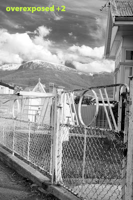
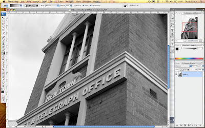
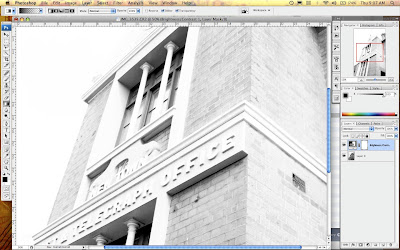
1 Create an adjustment layer for your image, in the above example I used a brightness/contrast layer and set this at the extreme end of brightness for dramatic effect.
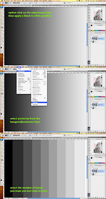
2 Option click on the adjustment layer to edit the it, and create a gradient going from black to white. Now you need to make this a stepped gradient, the easiest way to go is to select posterize from the image/adjust menu and set it at how many steps you want in your test strip, between 5 and 10 should be fine. Once you have completed this step, you should have a set of grey panels from black to white (see above).
3 Click back on your image layer and you should now have a finished test strip.
4 Print, assess tones and apply a gray in the brightness contrast over the whole image that looks best to you.
5 Print your corrected image
*In my example i have used the adjustment layer to adjust brightness contrast but you can use it for any of the funtions availabke in the adjustment layer pallette. By creatively combining different sets of gradients and effects you can create a monster teststrip that shows a huge nuber of variations. Givie it a go i am sure you will find it a very useful technique.
Sunday, August 24, 2008
Changing Focus in Your Images
The amazing thing about Photoshop is that there are often multiple ways to achieve a single outcome. After a conversation the other week with an very experienced photographer about creating focus masks manually in the darkroom, I thought why not recreate the same technique in photoshop?
This technique is intended to give you control over de-focussing parts of you image and includes a short discussion about the different blur options available in photoshop.
1. Setting up layers.
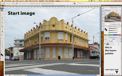
Now open a photo into Photoshop CS (you can use this with elements too) and duplicate the layer. To duplicate drag the background layer in the layers palette onto the icon that is a page with the corner turned over.
2.Setting up the maskig layer
Create a new empty layer between these two, this is going to be a masking layer.
3. Creating a contrast layer
Create a contrast layer so you can see where you are cutting.
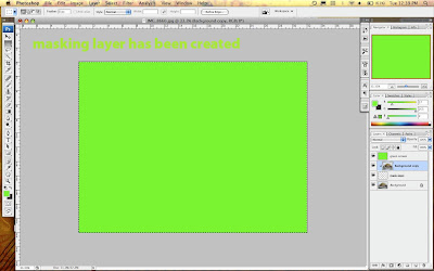
Make a layer on top of the layers stack and call this green screen
Select all and fill with a bright green
Now move this layer in the stack to second from the bottom.
4. Creating the mask
Option click between the top layer and the masking layer you should now have created a mask, there should be a small arrow on the top layer pointing into the mask layer.
Masking layers are difficult to describe, when there a no pixels on a masking layer, it shows none of the image layer it affects, it there is 100 percent pixels on the masking layer it shows 100 percent of the image. What this means in reality, is that as you paint a black onto the masking layer it will reveal that part of the image. You really need to try this out as it is a trick concept.
These masks are great because you don't do any damage to the image you are only changing the masking layer.
5. Paint in the masking layer to reveal your image
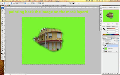
You should now see a solid green screen as the masking layer and it's image above are now invisible. Move to the masking layer and start painting onto the it using a black brush of a good size you should start to see your image appearing wherever you paint. To remove portions of the image you don't want, you simply select the eraser and erase the black on the mask layer.
What you need to do now is roughly isolate the section of the image you want to keep in focus,l in my example you can see the building in the forground. I have kept the edges soft so the image will smoothly transition into the blurred image we are about to create.
6. See the full image
Turn off the eye on the green screen layer to hide it.
You should now have the background layer visible.
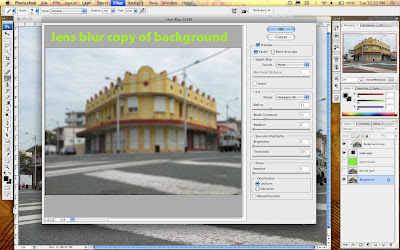
Duplicate this layer so you are working on a copy but keep down the bottom of the stack.
7. Defocus the background image
Phew that is all the setup work... now for the good stuff
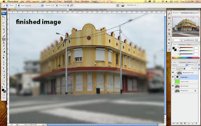
Select all on the background image copy and apply a lens blur filter, experiment with the amount till it looks good. Adjust the masking of the top layer so it looks natural.
There you have it, masking and de-focussing in one lesson, this is a big step please take careful note of the order of the layers in the images so you can see what is happening.
Saturday, August 23, 2008
File Formats For Fussy Photographers
File formats... there are endless discussions in Photography magazines about file formats pro's & cons lets just cut through all of that and get down to some effective simple advice so you can go out and take more photos.
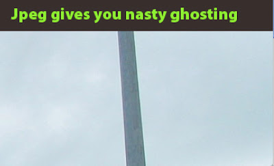
Jpeg - it's simple don't save any of your work in this format unless you are desperate to reduce file size for emailing, web or video work. This format tends to be destructive and to the eye of a photographer produces lower quality images. Check out the above close up of a detail of a power pole, there is a strange ghosting around the pole, this is a JPEG on high quality compression and it looks bad. The main problem with JPEG's is that this ghosting really messes up subtle tonality and the three dimensional qualities of a photo. Don't get me wrong JPEG is a very powerful compressor that is amazingly useful but for photographers compression is the opposite of what you want, ie great images.
... well, thats enough of a rant, if you are going to save a file save it as either:
Tiff - this is the classic file format that has lossless compression can be read by plenty of software and has proved to be very reliable over the years. Save in this and you cant go wrong.
Photoshop - save those stacked & layered documents in Adobe's PSD format for good quality and the ability to edit down the track.
If you are using an image storage application like IPhoto that really likes JPEG's use it only as a secondary program for viewing photos but keep a file of your original uncompressed files as well.
There are other file options that have their good points in specific areas but the above two are versatile and have stood the test of time. Leave all that talk of metadata and bizarre profiling to all those nerdy photography magazines or for people that need to manage a big library of images that is searchable.
Friday, August 22, 2008
Ahoy There! it's Levels Island
In the last article we had a look at what the levels controls do, but in this article we are going to have a look at one of the most common ways of improving photos especially colour images that your camera has given the JPEG treatment.
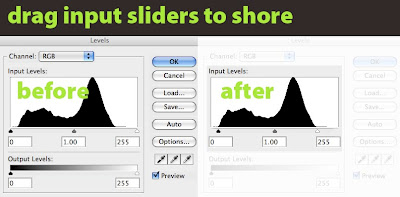
Welcome to Levels Island! Control L to find the treasure...Often, when you open an image that has been shot on auto or a variation of, you end up with a histogram in the levels settings that shows what looks like a mountainous island rising from the middle of the image. There is often plenty of flat water surrounding this mysterious island. In this case an easy point to start from is to move the black and white sliders onto the start of the island... or as I tell my students move those scurvy rowboats into the shore of levels island! Sometimes you have to drag those boats onto the beach and right up into the sand dunes, find the setting that looks good. Watch your tones carefully, be especially cautious about blowing out the tonal range of the whites, once you have sent them to Davey Jones locker they ain't coming back.
I know it's a silly analogy but editing photos in Photoshop should be a fun, creative process... so you Land Lubbers once you have those boats into the shore start experimenting with slowly adjusting the position of the midtone slider. This one is delicate so be gentle and remember it's start position is 1.00 in the panel below the slider.
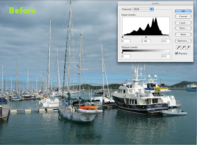
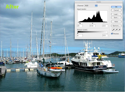
When you set your levels properly it should almost be like a fine haze has been removed from your image, its a simple but effective technique. Check out the difference in the above photos it has compressed the dynamic range slightly but has yielded stronger colour and clearer tones.
Don't forget command+L for levels. Make this one of your first stops in Photoshop and you too will find the buried treasure hidden in your photos on levels island!
Thursday, August 21, 2008
Adjusting Levels - White Treble Black Bass
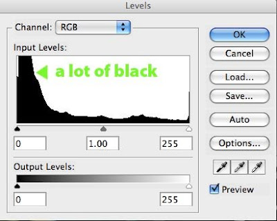
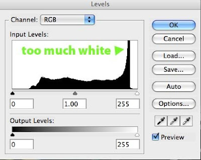
In my work flow I always do some adjustment of the levels of an image. levels gives you a look at the histogram for an image which is always good to check out. There was a dance track in the 90's called White Treble Black Bass, I am not sure if they are fans of adjusting levels in Photoshop but it is part of a handy analogy.
• The levels command is like the graphic equaliser for your stereo but for an image.
• The Blacks are on the left, the whites on the right
• The left slider controls at which point the colour rolls of to Black
• The right slider controls at which point the image rolls off to white
• The middle slider determines where the 50% midtone is
Below the histogram is a second set of sliders called output levels, these are limiters. Where the left one is set determines the darkest tone that will appear in the image. Where the right slider is, determines the lightest tone that will appear. Experiment with the controls to try it out, this slider isb more for limiting tonal range in final print or for production offset printing where solid blacks or total whites can be problematic.
Set the black and white sliders first then set the midpoint, remember you are looking to increase tonal range and increase the clarity of the image. Setting levels can make a huge difference to an image and is often the major difference between a straight out of the camera shot looking pretty good and really good.
Putting the grain back in
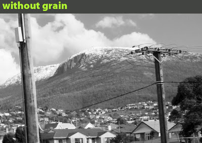
When you look closely at a digital photograph you notice that the tonal structure is really smooth, at magnification the image becomes hard to focus your eyes on. I find that this is a negative quality of digital for me, the grain in film based work seems to help your eyes to perceive the three dimensional space that an image is trying to recreate.
It sounds crazy but adding noise to the image actually helps to define shapes and give the image a more robust look.
There are software plugins available that can do this for you or you can also find hi-res scans of film grain available on the net. These scans are of a continuous mid tone gray from a piece of film and give you a fairly authentic looking grain structure on your digital image. To apply paste the grain on as a new layer and then set the layer to overlay mode. Now experiment with the opacity slider to get the result you are after.
To see the results of this you need to print to a really high quality printer and/or fairly large but as always the results are dependant on your imagery and you own personal style.
This is all a bit of a DIY approach and that is the fun of it however if you want to get quick high quality results then Alien Skin Exposure Plugin really delivers on simulating film without the fuss, but it is a piece of software you need to use a fair bit to justify the cost.
Using Adobe RAW in CS3 Photoshop
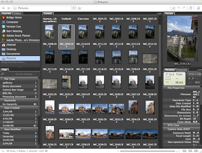
When you have your shots downloaded to your computer, use Adobe Bridge to browse to your Raw images and double click to open in Photoshop.
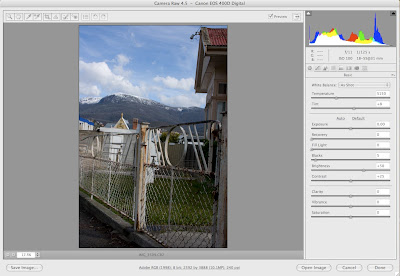
The file will now open up in the Raw plugin which is standard in CS3. On the left panel adjust the exposure control to put the pic where it starts to look good. Use a combo of the controls to get the image looking natural. All the controls are well labeled and do what you would expect.
The histogram on the top of the controls provides a great way of checking out the detail and range of colour in the shot. If you are not used to looking at a histogram then work off the image. The histogram shows the spread of tonality across the image, you would normally expect it to look something like a mountanious island coming out of the sea, large dips or holes in the island can indicate a potential problem with the image. I will go into more detail on reading histograms in a later post.
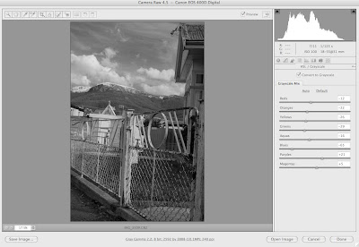
If you want to convert to Black and White then there is a great set of tools that allow you to alter the way colours convert to greyscale. Remember all of this work is non destructive. Take you time and approach it just like you would working in a darkroom. This is a critical time in getting your image right.
Trust your eyes... if it looks good then you are on the right track.
If you want a dramatic sky then try pulling down the blue slider until you are happy with the result.
Once you click ok (or option click ok to make a copy) you will head into Photoshop ready to push things further.
Wednesday, August 20, 2008
Exposure Tests Using RAW
Do you over expose, under expose, or trust your light meter when shooting digital?
In the good old days when I was shooting B&W film I pretty much always overexposed a stop or two. After doing my research on the web it really was time to get out in the winter air and start testing for myself. There is a complexity in assessing exposure in that you have to manually adjust each raw image to get the best look out of it. I don't go for super Ansell Adams style tonal range, I just like to aim for a photo that matches my own personal aesthetic.
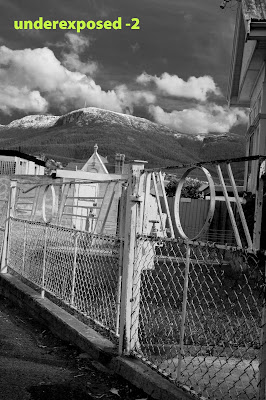
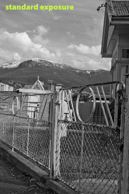
In the above shots I bracketed +2 to -2 and ran them through Raw in Photoshop, and assessed the results for myself to my own aesthetic. I recommend this is how you approach this process. Go out do some test shots yourself, then process to get what you consider to be the best and compare.
Digital Cameras are great at handling tonal range in the highlights but struggle in the low light areas, so overexposing seems to provide an excellent balance of detail in the shadows and detail in the highlights. If you like a bit of contrast and some moody sky try overexposing 2 stops... it works for me.
Next I will have a look in more detail at processing photos in RAW.
Keeping it RAW
First things first, if you are shooting in JPEG no matter how large your ccd you are not getting the best image quality and are removing a number of creative options out of your workflow.
If you are shooting with a digital camera set on a compressed format then the camera does quite a few things. It takes the output of the CCD runs it through the image processor in the camera, tweaks up the look of the image and then converts the data to JPG and stores on to your flash card. The camera has to do this all really quickly so you can take the next shot. For this reason the processors in cameras are optimised for speed not necessarily the ultimate in quality.
If you shoot in RAW then the camera takes the output off the CCD and dumps it straight onto the flash card for you to muck about with later on. What this means is you can now take you time optimising the file at your leisure without the time pressure of having to take another shot. You now have the ability to use the full power of your computer for what it is good at... doing complex computations in this case optimising your photos. So wake that computer up and get it cranking out some images!
If you are using Photoshop CS3 browse to your RAW files and open them up, they will open into the Raw plugin in Photoshop. This is where the good stuff begins and will be the subject of my next post.
Just a s a gentle reminder, there is a lot of conjecture on all things photography related, if you are not sure about something go and do the research there are some brilliant resources available on the net.
It is my belief that if you know what a great photo looks like why risk shooting in any other format than Raw? It is a bit of extra work, but at least you don't have to kick your family out of the bathroom so you can process some film!
Bringing back those golden days of the darkroom in digital form.
There is always something that has bugged me about Digital Photography, sure it's convenient, economical and produces good results... there just seemed to be something missing. Teaching darkroom photography I constantly see the enthusiasm people have for the tactile process of producing photos and I realised that in order to teach digital photography on an engaging level there was a need to look at the entire process and see what was missing.
After plenty of reading I realised that I had spent a huge amount of time developing my own photographic style and that the film type, developer etc was a major part of it. Moving over to digital the quality was great but I had lost all the elements that shaped the final quality of my photos.
I have done plenty of reading on the subject and read opinions from many different angles, here is my take on a Digital Photography workflow that works for me, is simple and most importantly brings back a bit of excitement to my work.
The following posts are my opinion on the subject, if you are not a fan of what I have to say then you might be better heading over to a more technically minded site and forming your own opinion, lets not forget that image quality is highly subjective.
Hi... please check this menu for articles
Hi, this is the first day of Bohemiantruckstop, I am a teacher in Hobart Tas specialising in teaching 3d and 2d computer graphics and design from grade 8 through to 12.
Stay tuned I wil be adding material covering: Digital Photography, Blender 3D and Adobe CS